Introduction
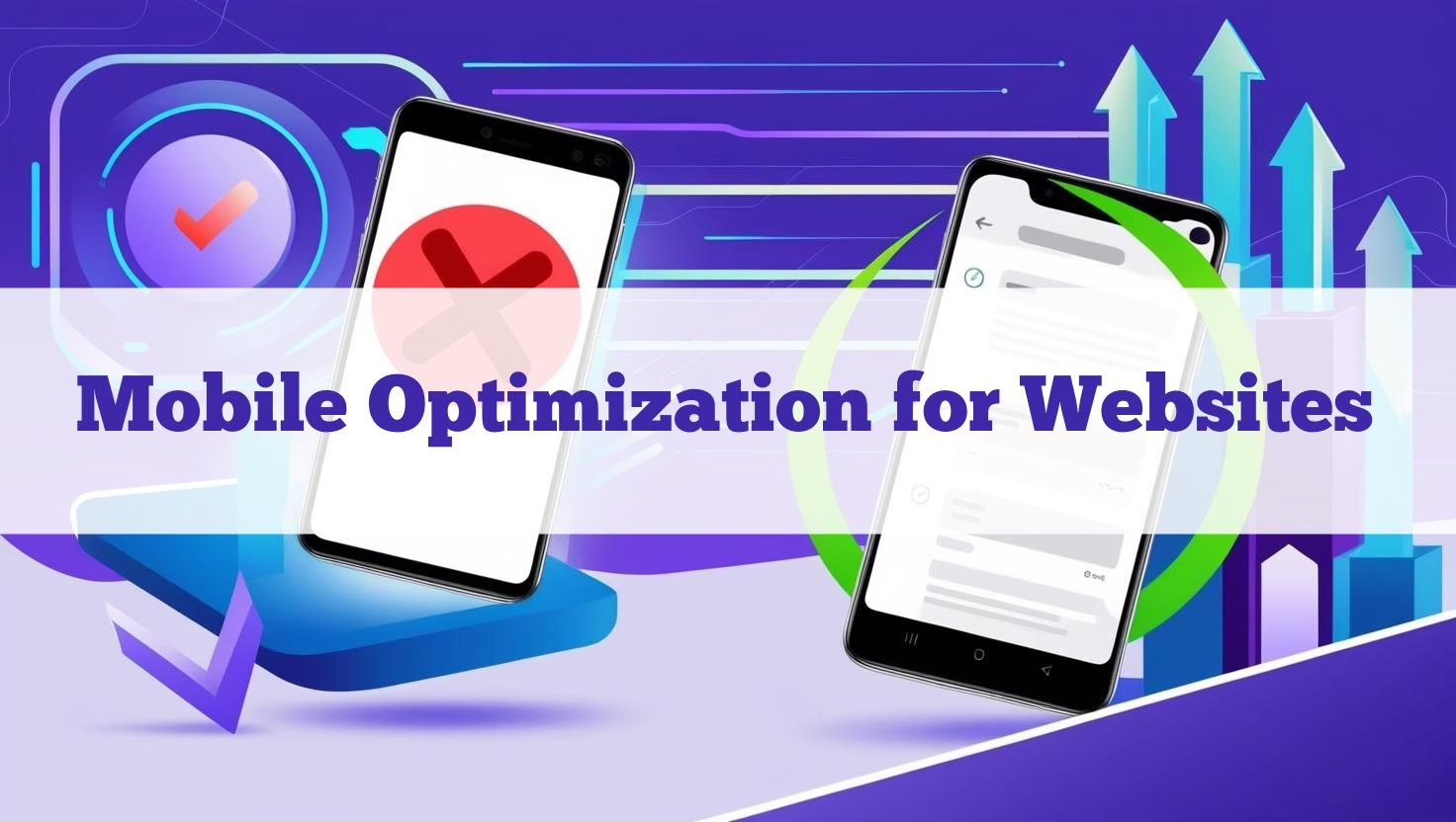
In today’s digital landscape, mobile optimization for websites is no longer optional—it’s critical. With over 60% of global traffic coming from mobile devices, unoptimized sites lose visitors and rankings. This guide covers everything you need to improve mobile optimization for websites in 2024.
SEO and Analytics: The Basics Every Website Needs Introduction: The Mobile-First Imperative
In today’s hyper-connected digital ecosystem, mobile optimization has evolved from a best practice to an absolute necessity. With global mobile traffic now accounting for over 60% of all web activity (Statista, 2024), businesses that neglect mobile optimization aren’t just missing opportunities—they’re actively alienating potential customers. The stakes have never been higher, as Google’s mobile-first indexing means your mobile site now directly determines your search rankings, visibility, and ultimately, your bottom line.
This comprehensive guide will take you through every critical aspect of mobile optimization, from fundamental technical requirements to cutting-edge strategies that will future-proof your website. We’ll explore:
-
The business case for mobile optimization
-
Technical implementation strategies
-
User experience best practices
-
Performance optimization techniques
-
Emerging trends and future-proofing
By the end of this guide, you’ll have a complete roadmap for transforming your website into a mobile powerhouse that delivers exceptional user experiences while maximizing conversions and search visibility.
Why Mobile Optimization for Websites Matters
1.1 Google’s Mobile-First Indexing
Search engines now prioritize mobile-optimized websites for rankings. Google’s transition to mobile-first indexing represents one of the most significant shifts in search engine history. Since 2019, Google has systematically moved to evaluate and rank websites based primarily on their mobile versions rather than desktop versions. This paradigm shift means:
-
Your mobile site’s content, structure, and performance now determine your search rankings
-
Desktop-only optimizations are no longer sufficient for SEO success
-
Websites without mobile optimization face severe ranking penalties
Real-world impact: A 2023 study by Moz revealed that websites with poor mobile optimization saw an average 35% drop in organic traffic after full mobile-first indexing implementation.
1.2 Core Web Vitals Performance
Optimize LCP, INP, and CLS for mobile-friendly websites. Modern consumers have zero tolerance for poor mobile experiences. Consider these critical statistics:
-
53% of mobile users abandon sites that take longer than 3 seconds to load (Google, 2024)
-
74% of users are more likely to return to mobile-friendly sites (Adobe Digital Trends Report)
-
48% of users feel frustrated when websites don’t work well on their devices (Google/SOASTA research)
The message is clear: mobile optimization directly impacts user satisfaction, engagement, and ultimately, conversion rates.
1.3 The Business Case for Mobile Optimization
Beyond technical considerations, mobile optimization delivers tangible business benefits:
E-commerce Impact:
-
Mobile-optimized checkout flows can increase conversions by up to 35% (Baymard Institute)
-
67% of users are more likely to buy from mobile-friendly sites (Adobe)
Lead Generation:
-
Mobile-optimized forms see 20-30% higher completion rates (Formisimo)
-
B2B companies with mobile-optimized sites generate 30% more leads (HubSpot)
Brand Perception:
-
57% of users won’t recommend a business with a poorly designed mobile site (SocPub)
-
89% of consumers are more likely to trust brands with mobile-optimized presences (Google)
Technical Foundations of Mobile Optimization
2.1 Responsive Web Design: The Non-Negotiable Foundation
Responsive design remains the gold standard for mobile optimization. A truly responsive site:
-
Uses fluid grids that adapt to any screen size
-
Implements flexible images and media
-
Leverages CSS media queries to apply device-specific styling
-
Maintains content parity across all devices
Implementation Checklist:
-
Use semantic HTML5 markup
-
Adopt a mobile-first CSS approach
-
Implement viewport meta tag:
<meta name="viewport" content="width=device-width, initial-scale=1.0"> -
Test across all breakpoints (320px to 1440px+)
2.2 Core Web Vitals: The Performance Trinity
Google’s Core Web Vitals have become critical ranking factors:
-
Largest Contentful Paint (LCP): Measures loading performance (target: <2.5s)
-
Optimize server response times
-
Implement lazy loading
-
Remove render-blocking resources
-
-
Interaction to Next Paint (INP): Measures interactivity (target: <200ms)
-
Minimize JavaScript execution time
-
Use Web Workers for complex tasks
-
Implement efficient event handlers
-
-
Cumulative Layout Shift (CLS): Measures visual stability (target: <0.1)
-
Include size attributes for images/videos
-
Reserve space for dynamic content
-
Avoid inserting content above existing content
-
2.3 Advanced Performance Optimization
Take your mobile performance further with these techniques:
Image Optimization:
-
Implement next-gen formats (WebP, AVIF)
-
Use responsive images with
srcset -
Employ intelligent lazy loading
-
Consider CDN-based image transformation
JavaScript Optimization:
-
Code splitting and tree shaking
-
Defer non-critical JS
-
Implement service workers for caching
Font Optimization:
-
Use
font-display: swap -
Subset fonts when possible
-
Consider system fonts for critical content
Mobile User Experience Mastery
3.1 Touch-Optimized Interface Design
Creating a thumb-friendly interface requires careful consideration:
Navigation Best Practices:
-
Place primary navigation within thumb reach (bottom or hamburger menu)
-
Ensure touch targets are at least 48x48px
-
Maintain 8-10mm spacing between interactive elements
-
Implement swipe-friendly carousels and galleries
Form Design Excellence:
-
Use appropriate input types (tel, email, number)
-
Implement smart autocomplete
-
Provide clear validation messages
-
Consider progressive disclosure for complex forms
3.2 Mobile-Specific UX Considerations
Readability Enhancements:
-
Maintain 16px base font size
-
Use 1.5 line-height for body text
-
Ensure 4.5:1 contrast ratio minimum
-
Implement dark mode compatibility
Micro-interactions:
-
Provide visual feedback for touches
-
Use subtle animations for state changes
-
Implement pull-to-refresh where appropriate
Offline Functionality:
-
Service worker caching strategies
-
Local storage for form persistence
-
Clear offline state indicators
Advanced Mobile Optimization Strategies
4.1 Progressive Web Apps (PWAs): The Next Evolution
PWAs bridge the gap between websites and native apps:
Key Benefits:
-
Installable on home screens
-
Offline functionality
-
Push notification capabilities
-
Improved performance through caching
Implementation Roadmap:
-
Create a web app manifest
-
Implement service workers
-
Add install prompts
-
Enable push notifications
-
Optimize for app-like navigation
4.2 Accelerated Mobile Pages (AMP) Revisited
While not mandatory, AMP still offers benefits for certain use cases:
Ideal Applications:
-
Content-heavy news sites
-
Recipe and how-to pages
-
Product listing pages
-
Long-form articles
Modern AMP Considerations:
-
AMP can now be paired with PWA features
-
New components support more dynamic content
-
Improved ad monetization options
4.3 Voice Search Optimization
With 27% of mobile searches now voice-based (Comscore, 2024):
Optimization Strategies:
-
Focus on natural language and question-based content
-
Implement schema markup for FAQs
-
Optimize for featured snippets
-
Ensure fast voice response times
Future-Proofing Your Mobile Strategy
5.1 Emerging Technologies to Watch
AI-Powered Experiences:
-
Dynamic content personalization
-
Predictive interfaces
-
Intelligent chatbots and virtual assistants
5G Optimization:
-
Prepare for near-instant load expectations
-
Explore richer media formats
-
Consider real-time interaction possibilities
Augmented Reality Integration:
-
WebAR implementation strategies
-
Product visualization enhancements
-
Location-based AR experiences
5.2 Continuous Optimization Framework
Establish an ongoing mobile optimization process:
-
Monthly Audits: Use Google Lighthouse and PageSpeed Insights
-
Quarterly UX Testing: Conduct real-user mobile testing
-
Bi-annual Strategy Reviews: Align with evolving standards
-
Annual Technology Assessments: Evaluate new frameworks and approaches
Conclusion: The Mobile Optimization Mandate
In today’s digital landscape, mobile optimization represents both a technical requirement and a significant business opportunity. By implementing the strategies outlined in this comprehensive guide, you’ll:
-
Improve search visibility through better alignment with Google’s mobile-first indexing
-
Enhance user experience, leading to higher engagement and conversions
-
Future-proof your digital presence against emerging technologies
-
Gain competitive advantage in an increasingly mobile-centric world
Final Checklist for Mobile Excellence:
✔ Implement responsive design with mobile-first approach
✔ Optimize for Core Web Vitals performance metrics
✔ Create thumb-friendly navigation and interfaces
✔ Consider PWA implementation for app-like experiences
✔ Establish ongoing testing and optimization processes


0 Comments