

Introduction
Effective website and mobile app design is critical for user engagement. This guide explores how layout impacts UX, SEO, and conversions. In today’s digital-first world, design and layout play a crucial role in determining the success of websites and mobile apps. A well-crafted interface enhances user experience (UX), engagement, and conversions, while a poorly designed one can drive users away within seconds.
This article explores why design and layout matter, their impact on usability, performance, and business success, and the key differences between website and mobile app design. By the end, you’ll understand best practices for creating intuitive, visually appealing, and high-performing digital products.
- First Impressions & Brand Perception
- User Experience (UX) & Usability
- Performance & Load Times
- Engagement & Conversions
- Mobile-Friendliness (Critical for Apps & Websites)
- Accessibility & Inclusivity
- SEO & Discoverability (For Websites)
- Key Differences Between Website & Mobile App Design
- Best Practices for Effective Design
1. First Impressions & Brand Perception
Why Design Matters in the First Few Seconds
Research shows that users form an opinion about a website or app in just 50 milliseconds. A clean, professional design builds trust and credibility, while a cluttered or outdated layout can make a brand appear unreliable.
Key Elements That Influence Perception:
- Color Psychology – Different colors evoke emotions (e.g., blue for trust, red for urgency).
- Typography – Readable fonts improve comprehension; mismatched fonts look unprofessional.
- Imagery & Icons – High-quality visuals enhance appeal; stock photos can feel generic.
- Consistency – Uniform design across pages strengthens brand identity.
For color psychology tips, read our branding strategy guide.
Example: Apple’s website uses minimalist design, ample white space, and high-res product images, reinforcing its premium brand image.

2. User Experience (UX) & Usability
How Layout Affects Navigation & Usability
A well-structured layout ensures users can find information effortlessly. Poor navigation leads to high bounce rates and lost conversions.
UX Principles for Effective Design:
- Hierarchy & Visual Flow – Important elements (headlines, CTAs) should stand out.
- Fitts’s Law – Buttons and links should be easy to click/tap.
- Hick’s Law – Fewer choices reduce decision fatigue (e.g., Netflix’s focused homepage).
- Responsive Design – Adapts seamlessly to different screen sizes (desktop, tablet, mobile).
Case Study: Amazon’s clean, grid-based layout makes product discovery effortless, contributing to its high conversion rates.

3. Performance & Load Times
How Design Impacts Speed
- Heavy images/videos slow down loading, increasing abandonment.
- Excessive animations can cause lag on low-end devices.
- Efficient coding (CSS/JS optimization) ensures smoother performance.
Best Practices for Faster Load Times:
✔ Compress images (WebP format).
✔ Use lazy loading for below-the-fold content.
✔ Minimize HTTP requests by combining files.
Stat: A 1-second delay in page load can reduce conversions by 7% (Akamai).
4. Engagement & Conversions
How Design Drives User Actions
- Strong CTAs (contrasting colors, action-oriented text).
- Scannable Content – Bullet points, short paragraphs, and bold headings.
- Visual Storytelling – Infographics, videos, and interactive elements keep users engaged.
Psychological Triggers in Design:
- Social Proof (testimonials, trust badges).
- Urgency (countdown timers, stock indicators).
- Personalization (recommendations based on user behavior).
Example: Spotify’s personalized playlists increase user retention by making the app feel tailor-made.

5. Mobile-Friendliness (Critical for Apps & Websites)
Key Mobile Design Considerations:
- Thumb-Friendly Navigation – Key actions within reach (bottom navigation bars).
- Adaptive Layouts – Flexbox/CSS Grid for fluid responsiveness.
- Touch Targets – Buttons should be at least 48×48 pixels for easy tapping.
Learn more about mobile-first design principles from Google.
Mobile App Design vs. Website Layout: Key Differences
| Feature | Mobile Website | Mobile App |
|---|---|---|
| Performance | Slower (browser-dependent) | Faster (native optimization) |
| Offline Access | Limited | Yes (cached data) |
| Push Notifications | Limited | Highly effective |
Stat: 53% of users abandon sites if they take over 3 seconds to load on mobile (Google).
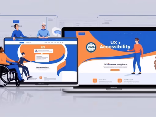
6. Accessibility & Inclusivity
Why Accessible Design Matters
Over 1 billion people live with disabilities. Ignoring accessibility excludes potential users and may lead to legal consequences (e.g., ADA compliance lawsuits).
Key Accessibility Practices:
- Color Contrast (4.5:1 ratio for text readability).
- Keyboard Navigation (for users who can’t use a mouse).
- Alt Text for Images (helps screen readers).
- Avoiding Auto-Playing Media (can disorient users).
Example: BBC’s website follows strict accessibility guidelines, ensuring usability for all.

7. SEO & Discoverability (For Websites)
How Design Affects Search Rankings
- Mobile-First Indexing – Google prioritizes mobile-friendly sites.
- Structured Data & Semantic HTML – Helps search engines understand content.
- Fast Load Speeds – A Core Web Vital metric for ranking.
SEO-Friendly Design Tips:
✔ Use descriptive headings (H1, H2, H3).
✔ Optimize image alt tags.
✔ Ensure internal linking improves crawlability.
Stat: 75% of users never scroll past the first page of search results (HubSpot).
Key Differences Between Website & Mobile App Design
| Factor | Website Design | Mobile App Design |
|---|---|---|
| Navigation | Menus, breadcrumbs | Hamburger menus, bottom bars |
| Interactions | Hover effects | Tap, swipe, gestures |
| Screen Space | Larger (desktop) | Limited (mobile) |
| Offline Access | Limited | Possible (cached data) |
| Performance | Browser-dependent | OS-optimized |
Best Practices for Effective Design
1. Keep It Simple (Less Is More)
- Avoid clutter; focus on key user actions.
- Use white space to improve readability.
2. Prioritize Speed & Performance
- Optimize media files.
- Use CDNs for faster delivery.
3. Test on Real Devices
- Check touch responsiveness, load times, and UI consistency.
4. Follow Platform Guidelines
- Material Design (Android) vs. Human Interface Guidelines (iOS).
5. Use Analytics & A/B Testing
- Continuously refine based on user behavior data.
Conclusion
Design and layout are not just about aesthetics—they shape user experience, engagement, and business success. A well-designed website or app:
✅ Builds trust with users.
✅ Improves usability and reduces friction.
✅ Boosts conversions through strategic CTAs.
✅ Enhances performance with optimized assets.
By following best practices in UX, accessibility, and responsive design, businesses can create digital experiences that retain users and drive growth.
By prioritizing website and mobile app design, businesses can improve usability and drive growth.


0 Comments